
The research URCPP students from computer science department presented their work today in Danforth Technology building. Their topics were mainly focused on artificial intelligence, computer vision and sustainability which I found quite engaging and enlightening. After their presentations, we had an approximately two-hour meeting involving the technology team and computer science team emphasizing on how we can improve our experience with work space to be more comfortable and welcoming. We also focused on the assigned names of the spaces related with the two departments (technology department and computer science department) which are located in the same building because the names casually assigned can become a custom in the future, and can possibly lead to exclusion and authorization issues. It was an interesting discussion where I got the opportunity to hear different ideas and perspectives from co-workers sharing the same building.
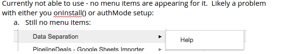
Regarding my work, I received the feedback regarding the sheet add-on from the google team, and it seemed that they cannot see the menus required to execute my program. I have tried looking into it several times, but the problem cannot be detected on my part. Attached below is the screenshot of the menu “Data Separation” and its sub menus “RowToSheet” and “ColumnToSheet”. Pressing either “RowToSheet” or “ColumnToSheet” will generate new sheets by replicating the parent sheet either row by row or column by column.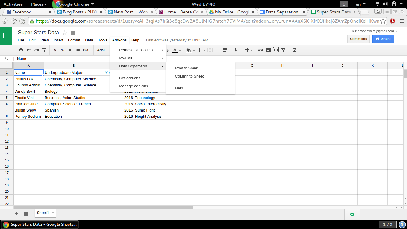 Nonetheless, google team cannot access my add-on like I do. Below is the snipped section of the feedback from google team addressing this issue. The major challenge for me in fixing this issue is not being able to detect the problem with my tests in the first place. I will have to research more on it ,and also delve into all the details of the submitted application files to see if the files were correctly updated or not.
On the other hand, I kept working on the front page of the website to obtain a professional and compelling outlook. Since I personally designed all the buttons on my own, the last thing I desired is a shabby first impression as one tries to access the portal.
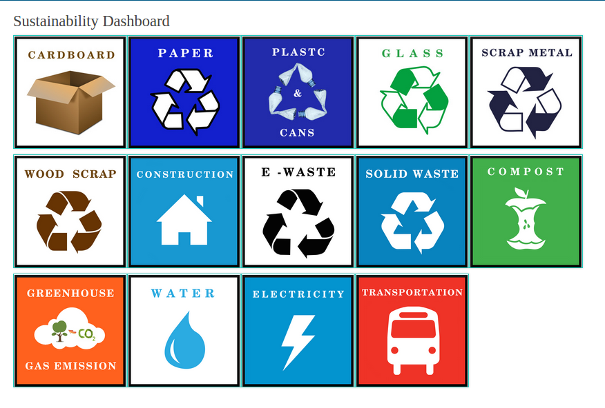
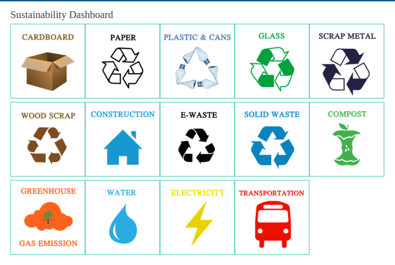
Above are two versions of the front page: the previous one and the current one. The later is preferred over the former for its consistent transparent background and space, alignment of captions, and adjusted icon proportions. At the end of the day, I achieved a different frontal look which I find more professional and tidy.
